dotwhisker: Dot-and-Whisker Plots of Regression Results
Frederick Solt and Yue Hu
2024-09-26
Source:vignettes/dotwhisker-vignette.Rmd
dotwhisker-vignette.RmdGraphs have long been known to be a more compact and effective means
of conveying the results of regression models than tables (Gelman, Pasarica, and Dodhia 2002; Kastellec and Leoni
2007), but many researchers continue to list these results in
tables. The reason, Kastellec and Leoni
(2007) surmised, is “simply put, it takes much greater effort to
produce a quality graph than a table.” The dotwhisker
package provides a quick and easy way to create highly customizable
dot-and-whisker plots for presenting and comparing the output of
regression models. It can be used to plot estimates of coefficients or
other quantities of interest (e.g., predicted probabilities) within a
single model or across different models: the estimates are presented as
dots and their confidence intervals as whiskers (see Kastellec and Leoni 2007, 765–67).
Users can easily customize the content of their plots: presenting
multiple models or results for a subset of variables is easy. Moreover,
by outputting ggplot objects (Wickham 2009), dotwhisker allows
users to further modify the format of their plots in nearly infinite
ways.
This vignette illustrates basic use of the package’s mainstay
function, dwplot, for creating dot-and-whisker plots from
model objects; more advanced uses of dwplot that employ
tidy data frames as input; and, finally, some useful variations of
dot-and-whisker plots that are easily made using other functions in the
dotwhisker package.
Basic Use: Plotting Results from One or More Regression Models
Generating dot-and-whisker plots from model objects generated by the
most commonly used regression functions is straightforward. To make a
basic dot-and-whisker plot of any single model object of a class
supported by parameters::parameters,
simply pass it to dwplot. For these examples, we’ll use the
mtcars dataset extracted from the 1974 volume of the US
magazine, Motor Trend.
#Package preload
library(dotwhisker)
library(dplyr)

# run a regression compatible with tidy
m1 <- lm(mpg ~ wt + cyl + disp + gear, data = mtcars)

# draw a dot-and-whisker plot
dwplot(m1)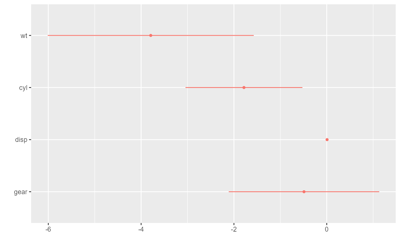
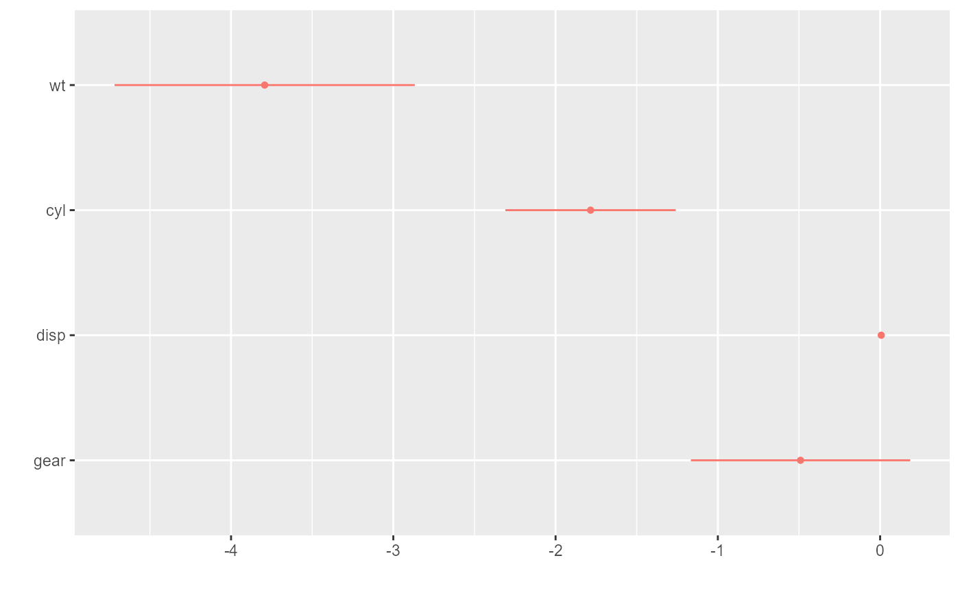
By default, the whiskers span the 95% confidence interval. To change
the width of the confidence interval, specify a ci argument
to pass to parameters::parameters():
Plotting the results of more than one regression model is just as
easy. Just pass the model objects to dwplot as a list. The
dodge_size argument is used to adjust the space between the
estimates of one variable when multiple models are presented in a single
plot. Its default value of .4 will usually be fine, but, depending on
the dimensions of the desired plot, more pleasing results may be
achieved by setting dodge_size to lower values when the
plotted results include a relatively small number of predictors or to
higher values when many models appear on the same plot.
m2 <- update(m1, . ~ . + hp) # add another predictor
m3 <- update(m2, . ~ . + am) # and another

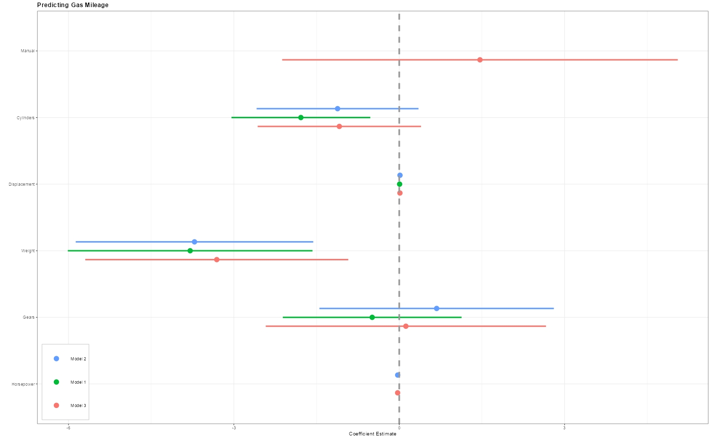
dwplot(list(m1, m2, m3))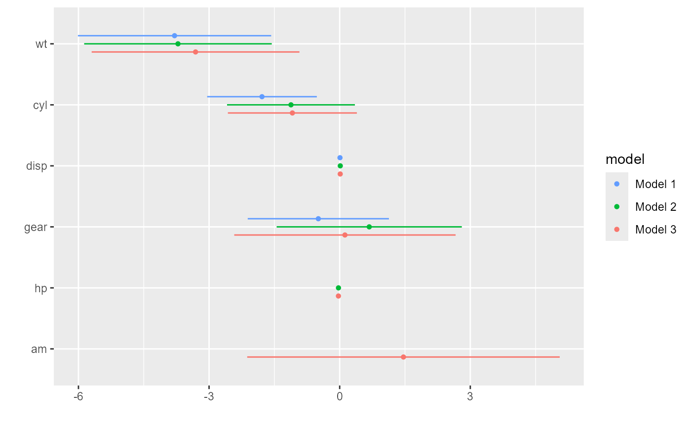
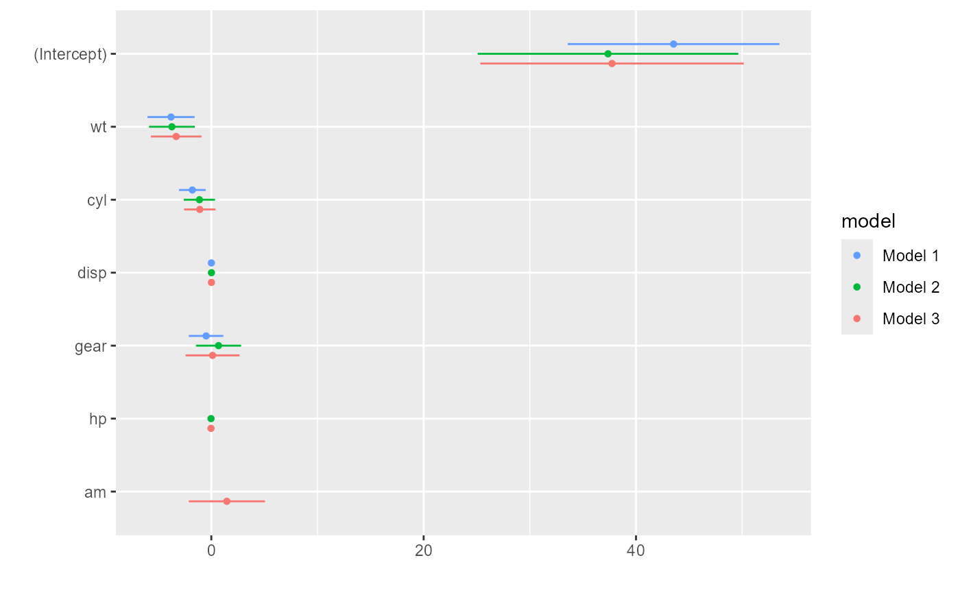
Model intercepts are rarely theoretically interesting (see Kastellec and Leoni 2007, 765), so they are
excluded by dwplot by default. They are easy to include if
desired, however, by setting the show_intercept argument to
true.
Users are free to customize the order of the models and variables to
present with the arguments model_order and
vars_order. Moreover, the output of dwplot is
a ggplot object. Add or change any ggplot
layers after calling dwplot to achieve the desired
presentation. Users can provide a named character vector to
relabel_predictors, a dotwhisker function,
conveniently renames the predictors. Note that both
vars_order and relabel_predictors changes the
presenting order of variables. When both are used, the later overwrites
the former.
dwplot(list(m1, m2, m3),
       vline = geom_vline(
           xintercept = 0,
           colour = "grey60",
           linetype = 2
       ),
       vars_order = c("am", "cyl", "disp", "gear", "hp", "wt"),
       model_order = c("Model 2", "Model 1", "Model 3")
       )  |>  # plot line at zero _behind_coefs
    relabel_predictors(
        c(
            am = "Manual",
            cyl = "Cylinders",
            disp = "Displacement",
            wt = "Weight",
            gear = "Gears",
            hp = "Horsepower"
        )
    ) +
    theme_bw(base_size = 4) +
    # Setting `base_size` for fit the theme
    # No need to set `base_size` in most usage
    xlab("Coefficient Estimate") + ylab("") +
    geom_vline(xintercept = 0,
               colour = "grey60",
               linetype = 2) +
    ggtitle("Predicting Gas Mileage") +
    theme(
        plot.title = element_text(face = "bold"),
        legend.position = c(0.007, 0.01),
        legend.justification = c(0, 0),
        legend.background = element_rect(colour = "grey80"),
        legend.title = element_blank()
) 
There are many other packages (e.g., coefplot) that have
the ability to draw dot-and-whisker plots of at least a single set of
regression results taking model objects as input. While this is very
convenient, it also comes with some severe limitations. First, many less
common model objects are not supported. Second, rescaling coefficients,
reordering them, or just plotting a subset of results is typically
impossible. And third, quantities of interest beyond coefficient
estimates cannot be plotted. The dotwhisker package avoids
all of these limitations by optionally taking as its input a tidy data
frame of estimates drawn from a model object rather than the model
object itself.
Advanced Use: Decoration and Modification
Plotting Results Stored in a Tidy Data Frame
In addition to model objects, the input for dwplot may
be a tidy data frame that includes three columns: term,
that is, the variable name; estimate, the regression
coefficients or other quantity of interest; and std.error,
the standard errors associated with these estimates. In place of
std.error one may substitute conf.low, the
lower bounds of the confidence intervals of the estimates, and
conf.high, the corresponding upper bounds. As noted above,
“tidy data” (Robinson 2015) refers such a
data frame of estimates for many common classes of model objects
(indeed, dwplot was written to expect a data.frame with the
columns term, estimate, and
std.error). When more than one model’s results are to be
plotted, an additional column model that identifies the two
models must be added to the data frame (alternate names for this last
column may be specified by using the model_name
argument).
# regression compatible with tidy
m1_df <- broom::tidy(m1) # create data.frame of regression results
m1_df # a tidy data.frame available for dwplot
## # A tibble: 5 × 5
## term estimate std.error statistic p.value
## <chr> <dbl> <dbl> <dbl> <dbl>
## 1 (Intercept) 43.5 4.86 8.96 0.00000000142
## 2 wt -3.79 1.08 -3.51 0.00161
## 3 cyl -1.78 0.614 -2.91 0.00722
## 4 disp 0.00694 0.0120 0.578 0.568
## 5 gear -0.490 0.790 -0.621 0.540
dwplot(m1_df) #same as dwplot(m1)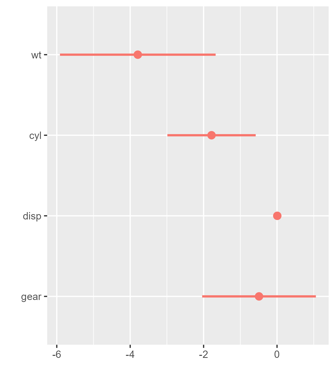
Using tidy can be helpful when one wishes to omit
certain model estimates from the plot. To illustrate, we drop the
intercept (although this is in fact done by dwplot
automatically by default):
m1_df <-
    broom::tidy(m1) |> filter(term != "(Intercept)") |> mutate(model = "Model 1")
m2_df <-
    broom::tidy(m2) |> filter(term != "(Intercept)") |> mutate(model = "Model 2")

two_models <- rbind(m1_df, m2_df)

dwplot(two_models)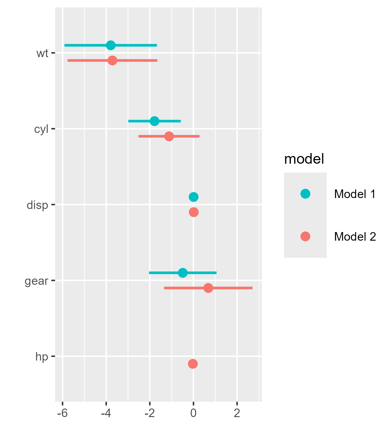
You can also filter by regular expressions. This can be helpful, for instance, if a model contains a factor with many levels (e.g., a dummy variable for each country) which you might not want to include in your plot.
# Transform cyl to factor variable in the data
m_factor <-
    lm(mpg ~ wt + cyl + disp + gear, data = mtcars |> mutate(cyl = factor(cyl)))

# Remove all model estimates that start with cyl*
m_factor_df <- broom::tidy(m_factor) |>
    filter(!grepl('cyl*', term))

dwplot(m_factor_df)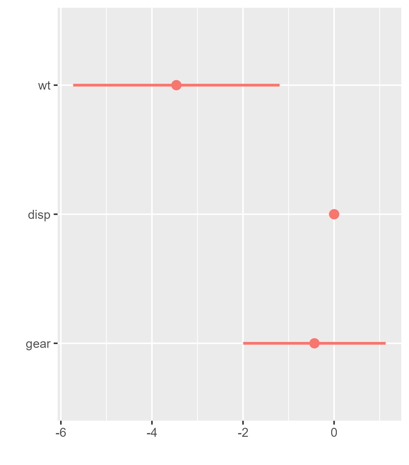
It can also be convenient to build a tidy data frame of regression results directly, that is, without first creating model objects:
# Run model on subsets of data, save results as tidy df, make a model variable, and relabel predictors
by_trans <- mtcars |>
    group_by(am) |>                                         # group data by trans
    do(broom::tidy(lm(mpg ~ wt + cyl + disp + gear, data = .))) |> # run model on each grp
    rename(model = am) |>                                     # make model variable
    relabel_predictors(c(
        wt = "Weight",
        # relabel predictors
        cyl = "Cylinders",
        disp = "Displacement",
        gear = "Gear"
    ))

by_trans
## # A tibble: 10 × 6
## # Groups: model [2]
## model term estimate std.error statistic p.value
## <dbl> <fct> <dbl> <dbl> <dbl> <dbl>
## 1 0 Weight -2.81 1.27 -2.22 0.0434
## 2 0 Cylinders -1.30 0.599 -2.17 0.0473
## 3 0 Displacement 0.00692 0.0129 0.534 0.601
## 4 0 Gear 1.26 1.81 0.696 0.498
## 5 0 (Intercept) 30.7 7.41 4.15 0.000986
## 6 1 Weight -7.53 2.77 -2.71 0.0265
## 7 1 Cylinders 0.198 1.70 0.116 0.910
## 8 1 Displacement -0.0146 0.0315 -0.464 0.655
## 9 1 Gear -1.08 2.14 -0.506 0.627
## 10 1 (Intercept) 48.4 11.1 4.34 0.00247
dwplot(by_trans,
       vline = geom_vline(
           xintercept = 0,
           colour = "grey60",
           linetype = 2
       )) + # plot line at zero _behind_ coefs
    theme_bw(base_size = 4) + xlab("Coefficient Estimate") + ylab("") +
    ggtitle("Predicting Gas Mileage by Transmission Type") +
    theme(
        plot.title = element_text(face = "bold"),
        legend.position = c(0.007, 0.01),
        legend.justification = c(0, 0),
        legend.background = element_rect(colour = "grey80"),
        legend.title.align = .5
    ) +
    scale_colour_grey(
        start = .3,
        end = .7,
        name = "Transmission",
        breaks = c(0, 1),
        labels = c("Automatic", "Manual")
    )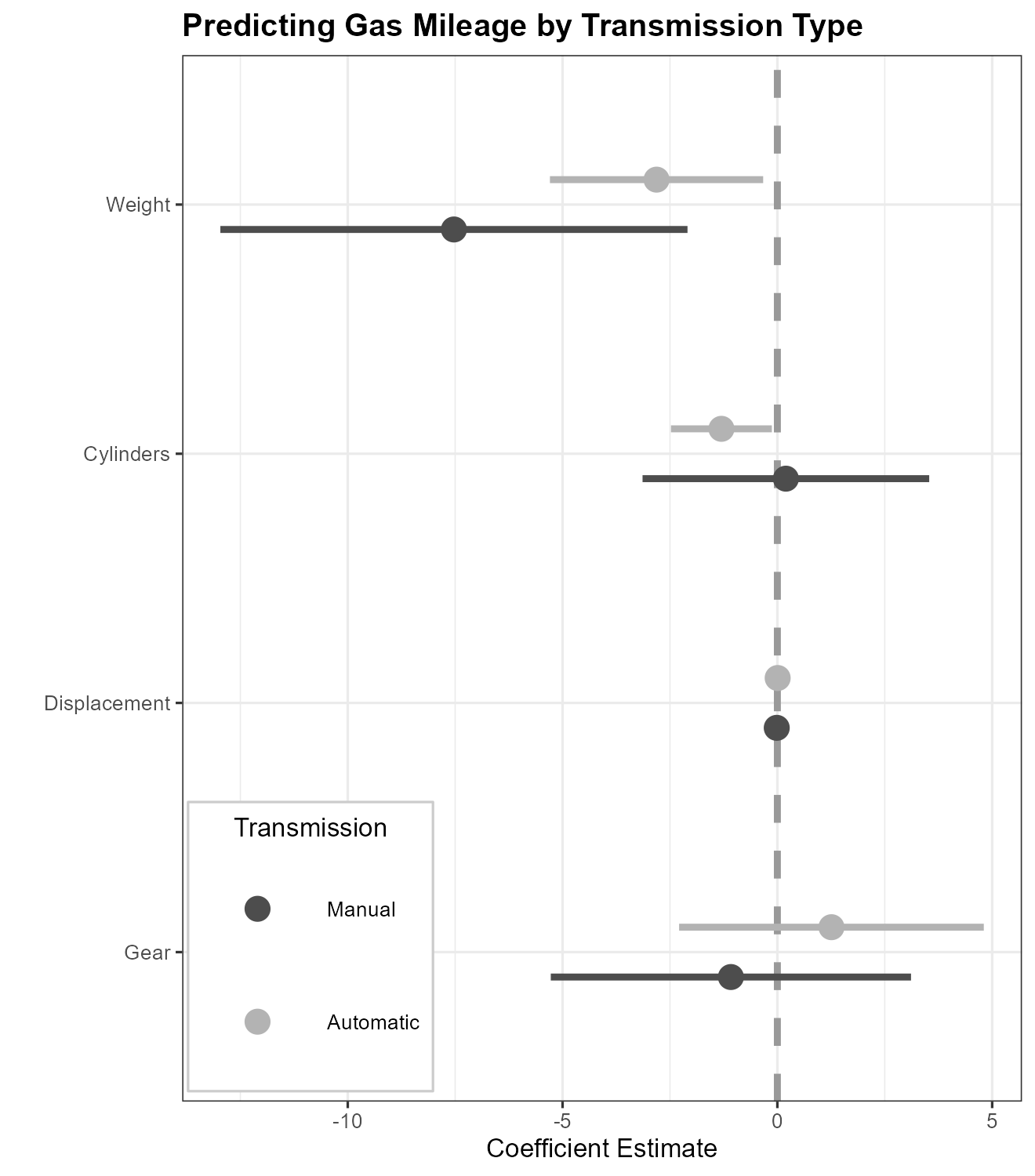
Also note in the above example the additional manner of using the
relabel_predictors function: in addition to being used on
the ggplot object created by dwplot before
further customization, it may also be used on a tidy data frame before
it is passed to dwplot.
Additionally, one can change the shape of the point estimate instead of using different colors. This can be useful, for example, when a plot needs to be printed in black and white. Here we also vary the linetype of the whiskers.
dwplot(
    by_trans,
    vline = geom_vline(
        xintercept = 0,
        colour = "grey60",
        linetype = 2
    ),
    # plot line at zero _behind_ coefs
    dot_args = list(aes(shape = model)),
    whisker_args = list(aes(linetype = model))
) +
    theme_bw(base_size = 4) + xlab("Coefficient Estimate") + ylab("") +
    ggtitle("Predicting Gas Mileage by Transmission Type") +
    theme(
        plot.title = element_text(face = "bold"),
        legend.position = c(0.007, 0.01),
        legend.justification = c(0, 0),
        legend.background = element_rect(colour = "grey80"),
        legend.title.align = .5
    ) +
    scale_colour_grey(
        start = .1,
        end = .1,
        # if start and end same value, use same colour for all models
        name = "Model",
        breaks = c(0, 1),
        labels = c("Automatic", "Manual")
    ) +
    scale_shape_discrete(
        name = "Model",
        breaks = c(0, 1),
        labels = c("Automatic", "Manual")
    ) +
    guides(
        shape = guide_legend("Model"),
        colour = guide_legend("Model")
    ) # Combine the legends for shape and color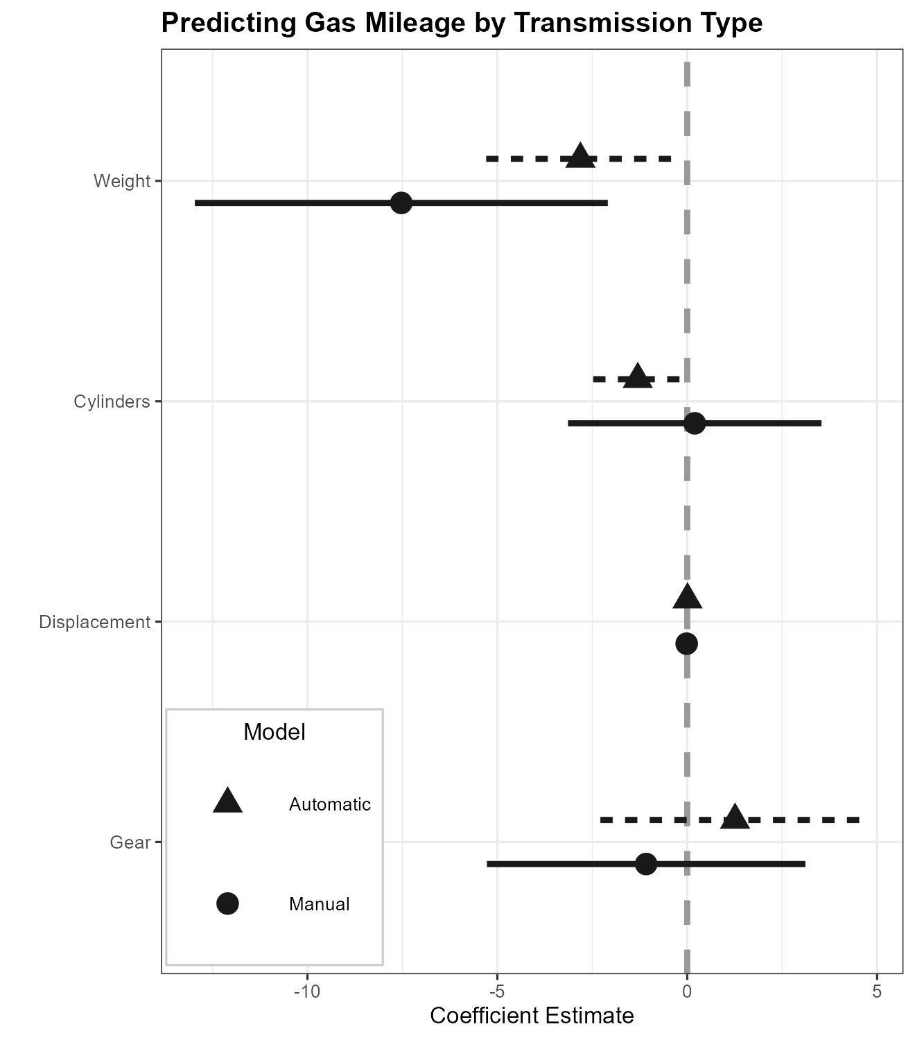
It is also easy to plot classes of model objects that are not
supported by tidy or parameters::parameters:
one simply extracts the results from the model object and builds the
data frame to pass to dwplot oneself. Many functions
generate results that can be extracted by coef().
# the ordinal regression model is not supported by tidy
m4 <- ordinal::clm(factor(gear) ~ wt + cyl + disp, data = mtcars)
m4_df <- coef(summary(m4)) |>
    data.frame() |>
    tibble::rownames_to_column("term") |>
    rename(estimate = Estimate, std.error = Std..Error)
m4_df
## term estimate std.error z.value Pr...z..
## 1 3|4 -4.03517968 2.45869171 -1.6411898 0.1007580
## 2 4|5 -1.37662018 2.28622404 -0.6021370 0.5470829
## 3 wt -1.13452561 0.98498075 -1.1518252 0.2493929
## 4 cyl 0.41701081 0.60620009 0.6879095 0.4915098
## 5 disp -0.01343896 0.01188167 -1.1310664 0.2580271
dwplot(m4_df)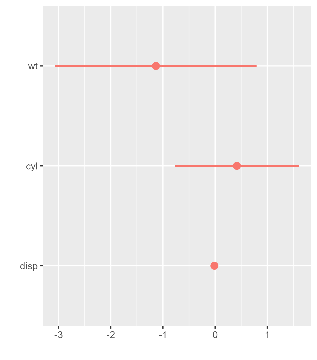
Working with a tidy data frame, it is similarly straightforward to
plot just a subset of results or to rescale or reorder coefficients. One
often desirable manipulation is to standardize the scales of variables.
Gelman (2008), for example, suggests
rescaling ordinal and continuous predictors by two standard deviations
to facilitate comparison with dichotomous predictors. Although this can
of course be done before model estimation, it can be more convenient to
simply rescale the coefficients afterwards; the by_2sd
function, which takes as arguments a data frame of estimates along with
the original data frame upon which the model was based, automates this
calculation.
# Customize the input data frame
m1_df_mod <-
    m1_df |>                 # the original tidy data.frame
    by_2sd(mtcars) |>                 # rescale the coefficients
    arrange(term)                      # alphabetize the variables

m1_df_mod  # rescaled, with variables reordered alphabetically
## # A tibble: 4 × 7
## term estimate std.error statistic p.value model by_2sd
## <chr> <dbl> <dbl> <dbl> <dbl> <chr> <lgl>
## 1 cyl -6.37 2.19 -2.91 0.00722 Model 1 TRUE
## 2 disp 1.72 2.98 0.578 0.568 Model 1 TRUE
## 3 gear -0.724 1.17 -0.621 0.540 Model 1 TRUE
## 4 wt -7.42 2.12 -3.51 0.00161 Model 1 TRUE
dwplot(m1_df_mod)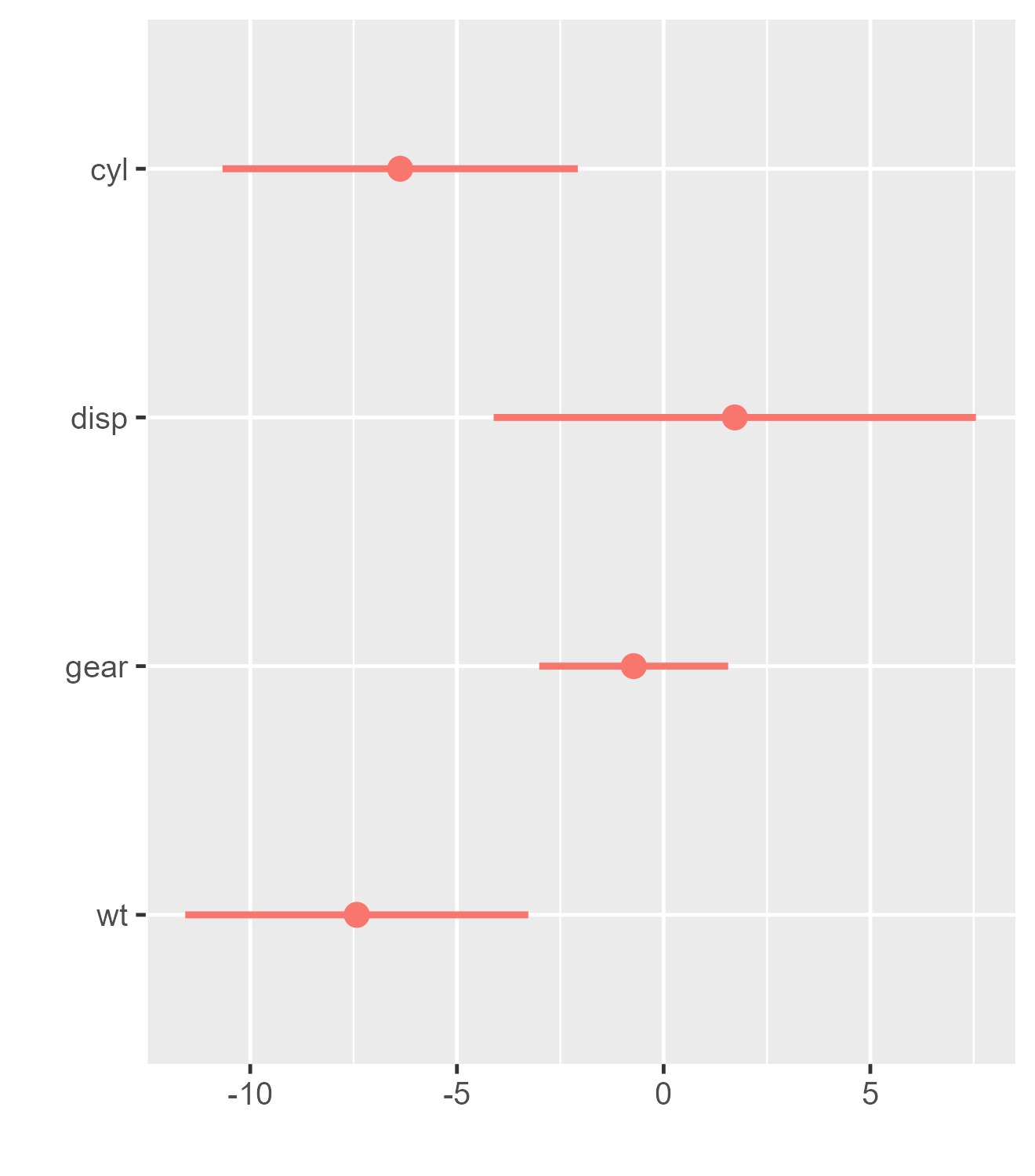
Grouping Predictors
It is frequently desirable to convey that the predictors in a model
depicted in a dot-and-whisker plot form groups of some sort. This can be
achieved by passing the finalized plot to the add_brackets
function. To pass the finalized plot to add_brackets
without creating an intermediate object, simply wrap the code that
generates it in braces ({ and }):
# Create list of brackets (label, topmost included predictor, bottommost included predictor)
three_brackets <- list(
    c("Overall", "Weight", "Weight"),
    c("Engine", "Cylinders", "Horsepower"),
    c("Transmission", "Gears", "Manual")
)

{
    dwplot(list(m1, m2, m3),
           vline = geom_vline(
               xintercept = 0,
               colour = "grey60",
               linetype = 2
           )) |> # plot line at zero _behind_ coefs
        relabel_predictors(
            c(
                wt = "Weight",
                # relabel predictors
                cyl = "Cylinders",
                disp = "Displacement",
                hp = "Horsepower",
                gear = "Gears",
                am = "Manual"
            )
        ) + xlab("Coefficient Estimate") + ylab("") +
        ggtitle("Predicting Gas Mileage") +
        theme(
            plot.title = element_text(face = "bold"),
            legend.position = c(0.993, 0.99),
            legend.justification = c(1, 1),
            legend.background = element_rect(colour = "grey80"),
            legend.title = element_blank()
        )
} |>
    add_brackets(three_brackets, fontSize = 0.3)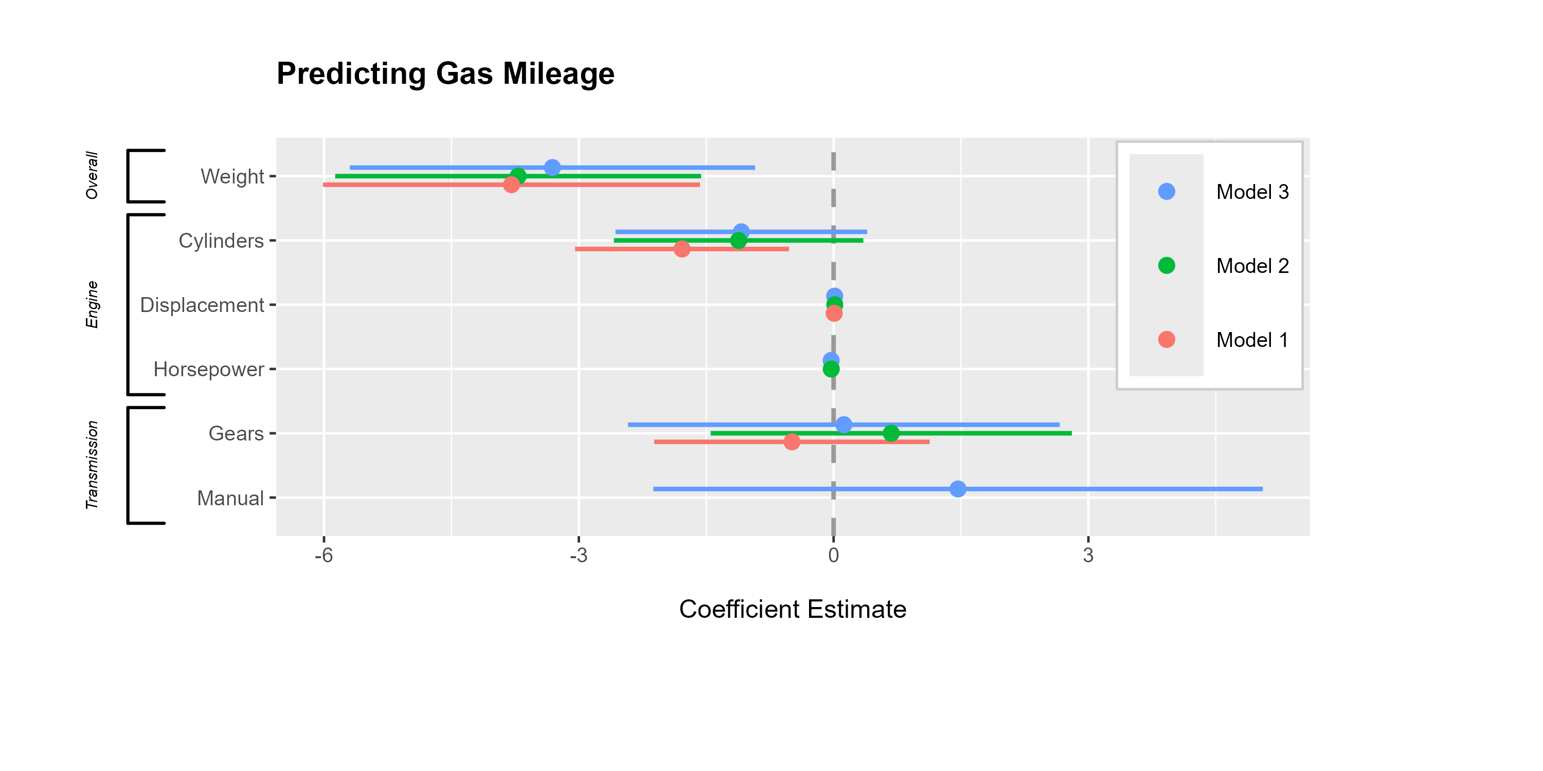
Presenting Regression Results as Normal Distributions
Inspired
by the way Edwards, Jacobs, and Forrest
(2016, 5) displayed regression coefficients as normal
distributions, dotwhisker now provides an easy way to make
similar plots. To create such plots, call dwplot as always
but include the argument style = "distribution", then
customize with other dotwhisker functions and
ggplot additions as usual:
by_transmission_brackets <- list(
    c("Overall", "Weight", "Weight"),
    c("Engine", "Cylinders", "Horsepower"),
    c("Transmission", "Gears", "1/4 Mile/t")
)

{
    mtcars %>%
        split(.$am) |>
        purrr::map( ~ lm(mpg ~ wt + cyl + gear + qsec, data = .x)) |>
        dwplot(style = "distribution") |>
        relabel_predictors(
            wt = "Weight",
            cyl = "Cylinders",
            disp = "Displacement",
            hp = "Horsepower",
            gear = "Gears",
            qsec = "1/4 Mile/t"
        ) +
        theme_bw(base_size = 4) + xlab("Coefficient") + ylab("") +
        geom_vline(xintercept = 0,
                   colour = "grey60",
                   linetype = 2) +
        theme(
            legend.position = c(.995, .99),
            legend.justification = c(1, 1),
            legend.background = element_rect(colour = "grey80"),
            legend.title.align = .5
        ) +
        scale_colour_grey(
            start = .8,
            end = .4,
            name = "Transmission",
            breaks = c("Model 0", "Model 1"),
            labels = c("Automatic", "Manual")
        ) +
        scale_fill_grey(
            start = .8,
            end = .4,
            name = "Transmission",
            breaks = c("Model 0", "Model 1"),
            labels = c("Automatic", "Manual")
        ) +
        ggtitle("Predicting Gas Mileage by Transmission Type") +
    theme(plot.title = element_text(face = "bold", hjust = 0.5))
} |>
    add_brackets(by_transmission_brackets, fontSize = 0.3)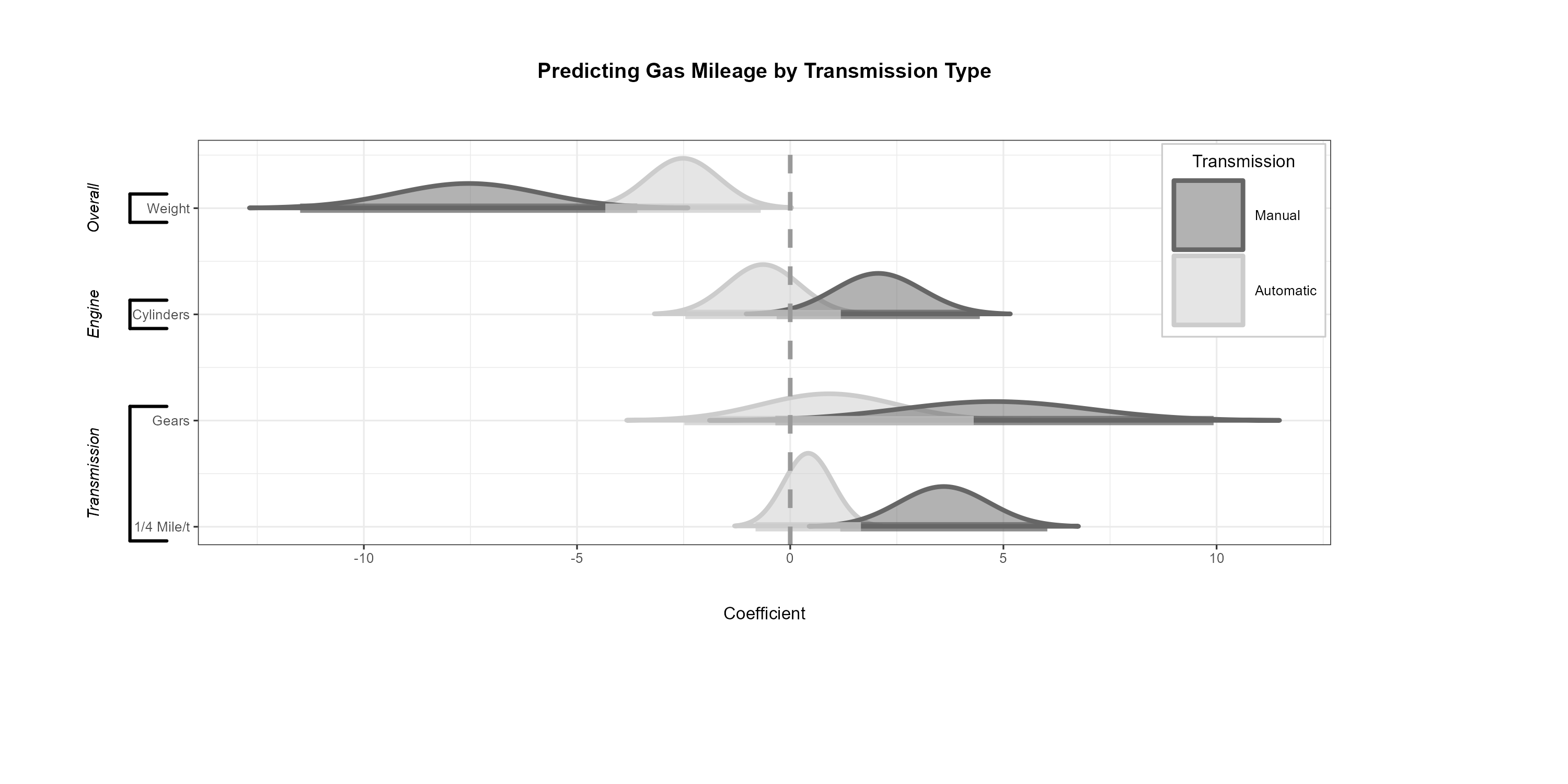
The ‘Secret Weapon’ and ‘Small Multiple’ Plots
A variation of dot-and-whisker plot is used to compare the estimated
coefficients for a single predictor across many models or datasets:
Andrew Gelman calls such plots the
‘secret weapon’. They are easy to make with the
secret_weapon function. Like dwplot, the
function accepts both lists of model objects and tidy data frames as
input. The var argument is used to specify the predictor
for which results are to be plotted.
data(diamonds)

# Estimate models for many subsets of data, put results in a tidy data.frame
by_clarity <- diamonds |>
    group_by(clarity) |>
    do(broom::tidy(lm(price ~ carat + cut + color, data = .), conf.int = .99)) |>
    ungroup() |>
  rename(model = clarity)

# Deploy the secret weapon
secret_weapon(by_clarity, var = "carat") +
    xlab("Estimated Coefficient (Dollars)") + ylab("Diamond Clarity") +
    ggtitle("Estimates for Diamond Size Across Clarity Grades") +
    theme(plot.title = element_text(face = "bold"))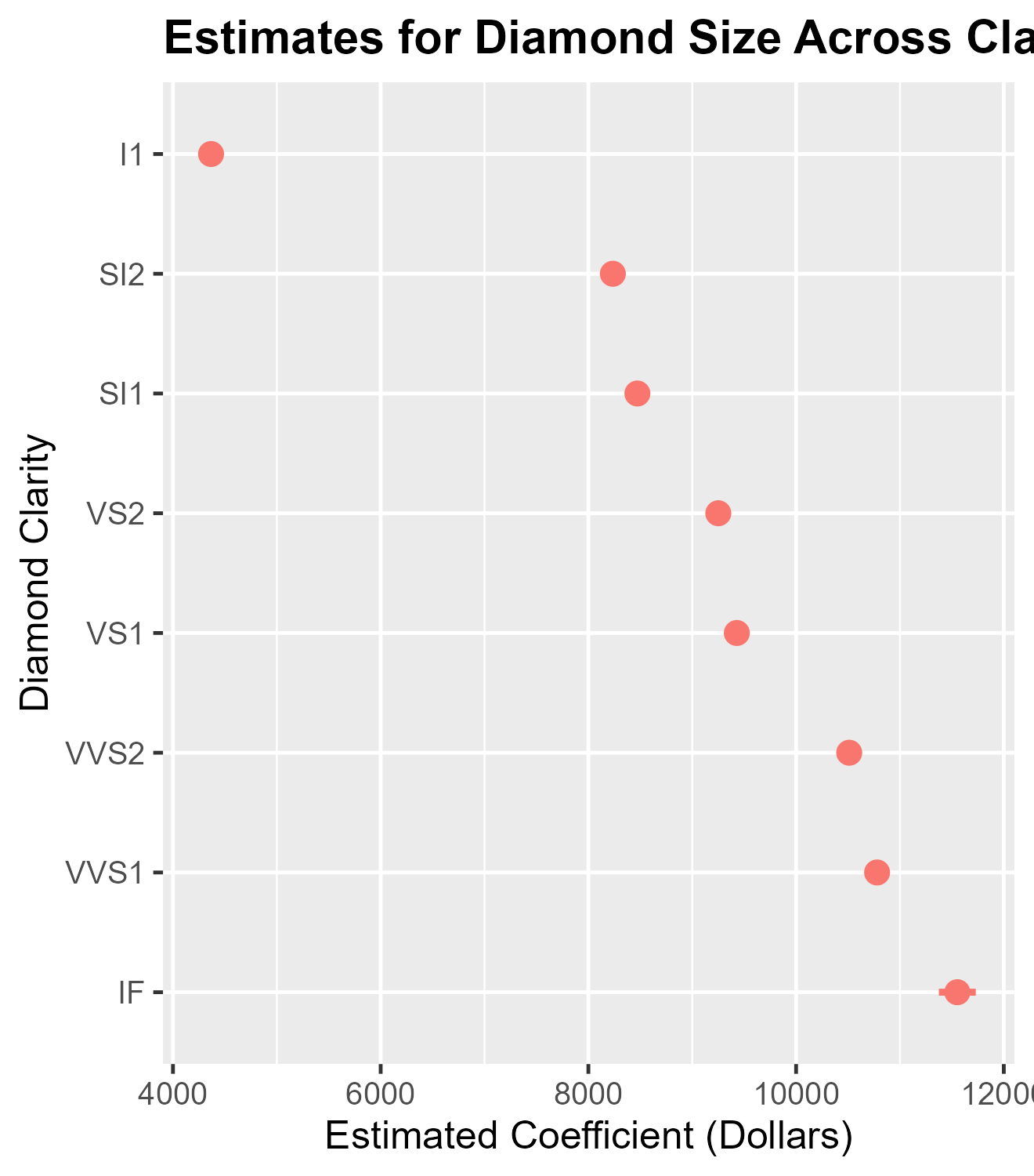
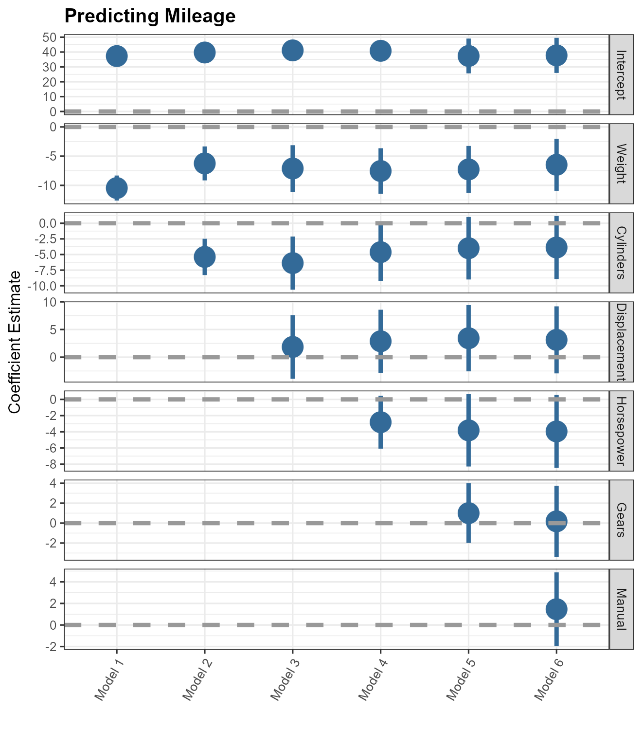
A final means of presenting many models’ results at once in a
particularly compact format is the “small multiple” plot of regression
results (see Kastellec and Leoni 2007,
766). Small-multiple plots present estimates in multiple panels,
one for each variable: they are similar to a stack of secret weapon
plots. The small_multiple function makes generating these
plots simple. Here, we pass a tidy data frame of six models to the
function so we can to rescale the coefficients first, but the function
can accept a list of model objects as well.
# Generate a tidy data frame of regression results from six models
m <- list()
ordered_vars <- c("wt", "cyl", "disp", "hp", "gear", "am")
m[[1]] <- lm(mpg ~ wt, data = mtcars)
m123456_df <- m[[1]] |>
    broom::tidy() |>
    by_2sd(mtcars) |>
    mutate(model = "Model 1")
for (i in 2:6) {
    m[[i]] <- update(m[[i - 1]], paste(". ~ . +", ordered_vars[i]))
    m123456_df <- rbind(m123456_df,
                        m[[i]] |>
                            broom::tidy() |>
                            by_2sd(mtcars) |>
                            mutate(model = paste("Model", i)))
}

# Relabel predictors (they will appear as facet labels)
m123456_df <- m123456_df |>
    relabel_predictors(
        c(
            "(Intercept)" = "Intercept",
            wt = "Weight",
            cyl = "Cylinders",
            disp = "Displacement",
            hp = "Horsepower",
            gear = "Gears",
            am = "Manual"
        )
    )

# Generate a 'small multiple' plot
small_multiple(m123456_df) +
    theme_bw(base_size = 4) + ylab("Coefficient Estimate") +
    geom_hline(yintercept = 0,
               colour = "grey60",
               linetype = 2) +
    ggtitle("Predicting Mileage") +
    theme(
        plot.title = element_text(face = "bold"),
        legend.position = "none",
        axis.text.x = element_text(angle = 60, hjust = 1)
) 
To facilitate comparisons across, e.g., results generated across
different samples, one can cluster the results presented in a small
multiple plot. To do so, results that should be clustered should have
the same value of model, but should be assigned different
values of an additional submodel variable included in the
tidy data frame passed to small_multiple. (We also
replicate three examples in Kastellec and Leoni
(2007) with dotwhisker in a separate vignette,
“kl2007_examples”.)
# Generate a tidy data frame of regression results from five models on
# the mtcars data subset by transmission type
ordered_vars <- c("wt", "cyl", "disp", "hp", "gear")
mod <- "mpg ~ wt"

by_trans2 <- mtcars |>
    group_by(am) |>                        # group data by transmission
    do(broom::tidy(lm(mod, data = .))) |>         # run model on each group
    rename(submodel = am) |>               # make submodel variable
    mutate(model = "Model 1") |>           # make model variable
    ungroup()

for (i in 2:5) {
    mod <- paste(mod, "+", ordered_vars[i])
    by_trans2 <- rbind(
        by_trans2,
        mtcars |>
            group_by(am) |>
            do(broom::tidy(lm(mod, data = .))) |>
            rename(submodel = am) |>
            mutate(model = paste("Model", i)) |>
            ungroup()
    )
}

# Relabel predictors (they will appear as facet labels)
by_trans2 <- by_trans2 |>
    select(-submodel, everything(), submodel) |>
    relabel_predictors(
        c(
            "(Intercept)" = "Intercept",
            wt = "Weight",
            cyl = "Cylinders",
            disp = "Displacement",
            hp = "Horsepower",
            gear = "Gears"
        )
    )

by_trans2
## # A tibble: 40 × 7
## term estimate std.error statistic p.value model submodel
## <fct> <dbl> <dbl> <dbl> <dbl> <chr> <dbl>
## 1 Intercept 31.4 2.95 10.7 6.01e- 9 Model 1 0
## 2 Intercept 46.3 3.12 14.8 1.28e- 8 Model 1 1
## 3 Weight -3.79 0.767 -4.94 1.25e- 4 Model 1 0
## 4 Weight -9.08 1.26 -7.23 1.69e- 5 Model 1 1
## 5 Intercept 34.6 2.48 13.9 2.31e-10 Model 2 0
## 6 Intercept 46.2 3.17 14.6 4.51e- 8 Model 2 1
## 7 Weight -2.23 0.752 -2.96 9.19e- 3 Model 2 0
## 8 Weight -7.40 2.40 -3.09 1.15e- 2 Model 2 1
## 9 Cylinders -1.30 0.379 -3.43 3.43e- 3 Model 2 0
## 10 Cylinders -0.789 0.953 -0.828 4.27e- 1 Model 2 1
## # ℹ 30 more rows
small_multiple(by_trans2) +
    theme_bw(base_size = 4) +
    ylab("Coefficient Estimate") +
    geom_hline(yintercept = 0,
               colour = "grey60",
               linetype = 2) +
    theme(
        axis.text.x  = element_text(angle = 45, hjust = 1),
        legend.position = c(0.02, 0.008),
        legend.justification = c(0, 0),
        legend.title = element_text(size = 8),
        legend.background = element_rect(color = "gray90"),
        legend.spacing = unit(-4, "pt"),
        legend.key.size = unit(10, "pt")
    ) +
    scale_colour_hue(
        name = "Transmission",
        breaks = c(0, 1),
        labels = c("Automatic", "Manual")
    ) +
    ggtitle("Predicting Gas Mileage\nby Transmission Type")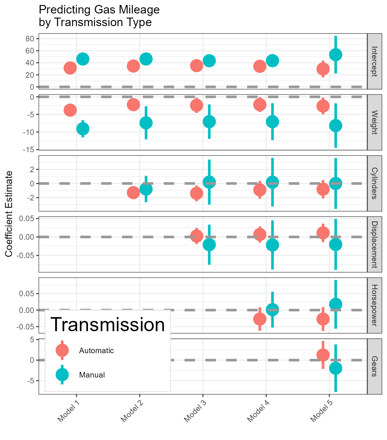
Model Fit Statistics
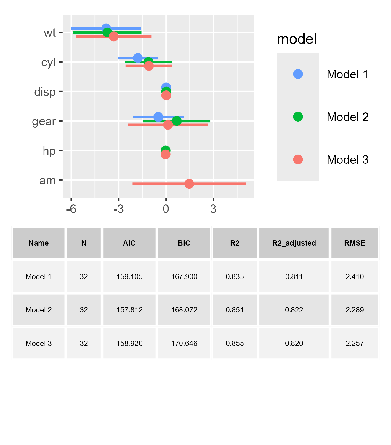
When presenting visualized outputs, users often receive comments that the plots cannot convey all the information a regression table contains, such as the model fits. Upon such comments, there are usually two types of solution. One is to present the regression tables in an appendix, despite the primary information has already been given by the dot-whisker plots. The second option is to add the statistics manually into the plots as an annotation (e.g., Kastellec and Leoni 2007, fig. 6). To make the application of the second solution more user friendly and minimize the need for lengthy, distracting regression tables (even relegated into an appendix), we provide an option to incorporates model fit statistics directly beneath the dot-whisker plots.
Thanks for the function from the excellent package
performance, the model fits can be easily extracted into an
data.frame. Based on performance, together
with another life-saving package for ggplot visualization,
patchwork, we offer the show_stats argument in
dwplot and small_multiple. When the argument
is set to be TRUE, users will see the model fits appearing
below the dot-whisker plot:
dwplot(m1, show_stats = TRUE, stats_size = 3)
small_multiple(list(m1, m2, m3), show_stats = TRUE, stats_size = 3)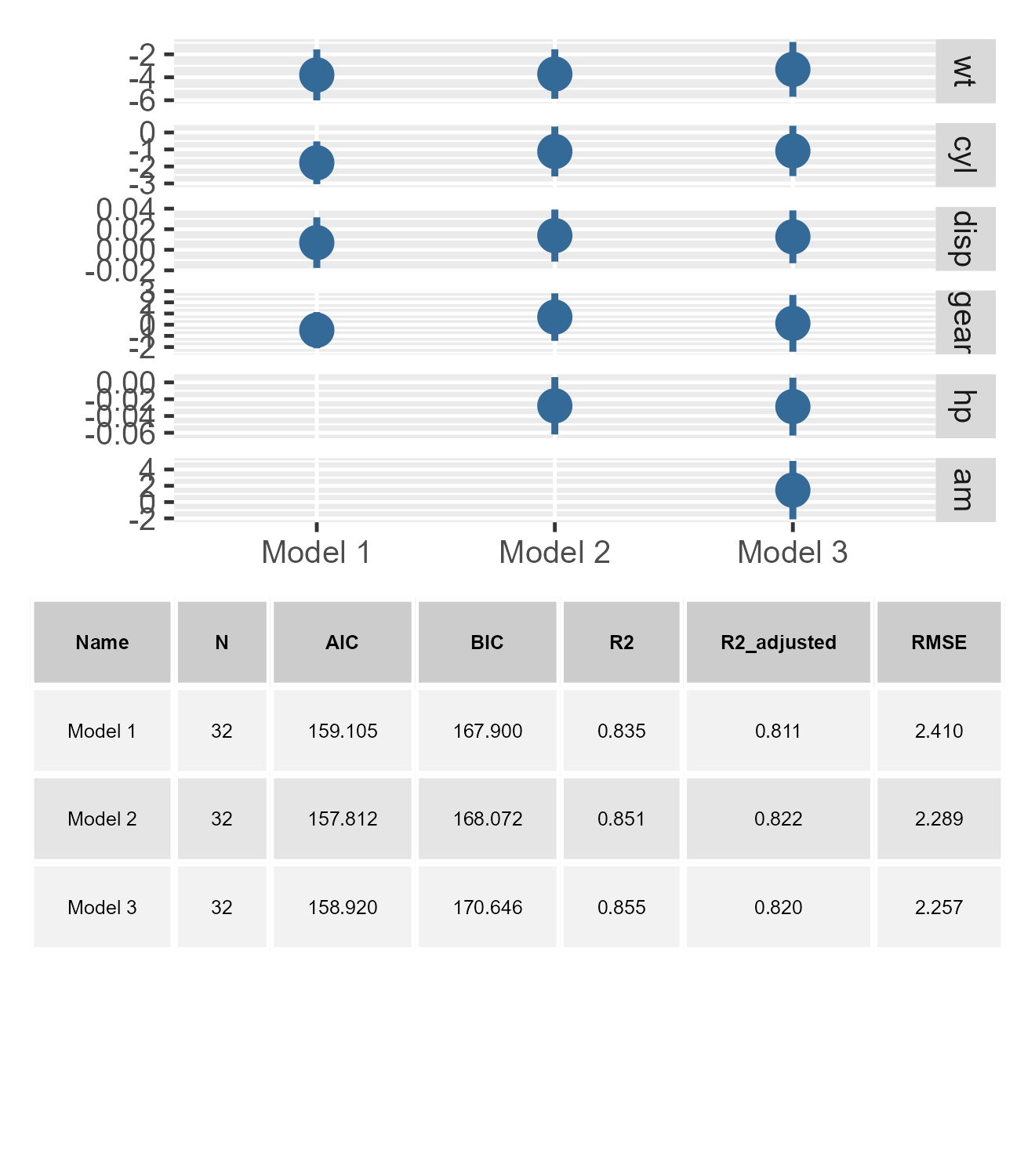
For added flexibility, we also include a suit of stats_*
functions for users’ fine-tuning the presentation of these statistics.
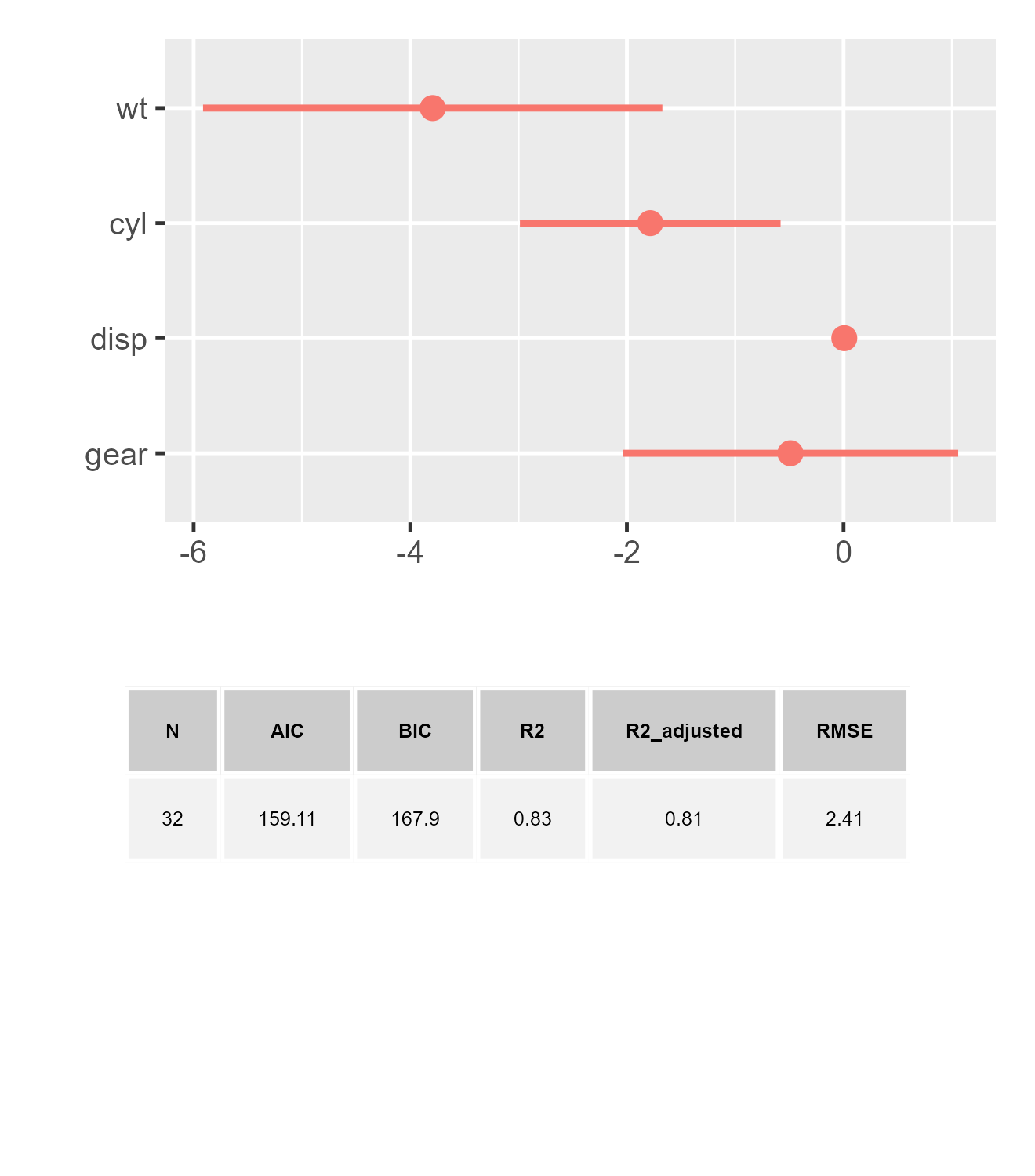
Furthermore, we offer the stats_tb argument, by which users
can input customized fitness information as a
data.frame.
Here are some tips for using this advanced function:
Different model types often yield varied model fit statistics. By default,
dotwhiskerdisplays all these statistics collectively. However, this can lead to an excessively wide bin beneath the plot. To address this, users have the option to setstats_comparetoTRUE. Activating this argument ensures that only the shared, comparable metrics are retained, streamlining the presentation.Since the model fits needs to be calculated with the raw model outputs, the model fits will not be able to presented with customized model outputs (i.e., a
data.frameortibble). Users have to give the customized model fit statistics, as well. It is an easy job, though, with our hiddendw_statsfunction, if the original models are compatible with theperformancepackagedotwhiskerrequires raw model outputs to calculate model fit statistics. Consequently, when using customized model outputs (like adata.frameortibble), the automatic generation of model fit statistics is not feasible. In such cases, users must provide the customized model fit statistics separately. Fortunately, this task can be simplified by the hiddendw_statsfunction ofdotwhisker. This function is particularly efficient if the original models are compatible with theperformancepackage, facilitating seamless integration of model fit statistics.
stats_fakeCustom <-
  dotwhisker:::dw_stats(m1, stats_digits = 2)

dwplot(
  m1_df,
  show_stats = TRUE,
  stats_tb = stats_fakeCustom,
  stats_size = 3
)
- Currently, the function for displaying model fit is not directly
compatible with the
relabel_predictorsandadd_bracketsfunctions. However, there is a workaround for integrating these features. The example below illustrates this method. It involves separately generating the model fits and then manually merging them with the bracket-enhanced dotwhisker plot.
library(gridExtra)
library(patchwork)

three_brackets <- list(
    c("Overall", "Weight", "Weight"),
    c("Engine", "Cylinders", "Horsepower"),
    c("Transmission", "Gears", "Manual")
)

plot_brackets <- {
    dwplot(m3,
           vline = geom_vline(
               xintercept = 0,
               colour = "grey60",
               linetype = 2
           )) |> # plot line at zero _behind_ coefs
        relabel_predictors(
            c(
                wt = "Weight",
                # relabel predictors
                cyl = "Cylinders",
                disp = "Displacement",
                hp = "Horsepower",
                gear = "Gears",
                am = "Manual"
            )
        ) + xlab("Coefficient Estimate") + ylab("") +
        ggtitle("Predicting Gas Mileage")
} |>
    add_brackets(three_brackets, fontSize = 0.3)

plot_brackets / tableGrob(
  dotwhisker:::dw_stats(
    m3,
    stats_digits = 2,
    stats_compare = FALSE
  ),
  rows = NULL,
  theme = ttheme_default(base_size = 3)
) +
  plot_layout(heights = c(5, -0.5, 1)) # the negative value is used to adjust the space between the plot and the model fits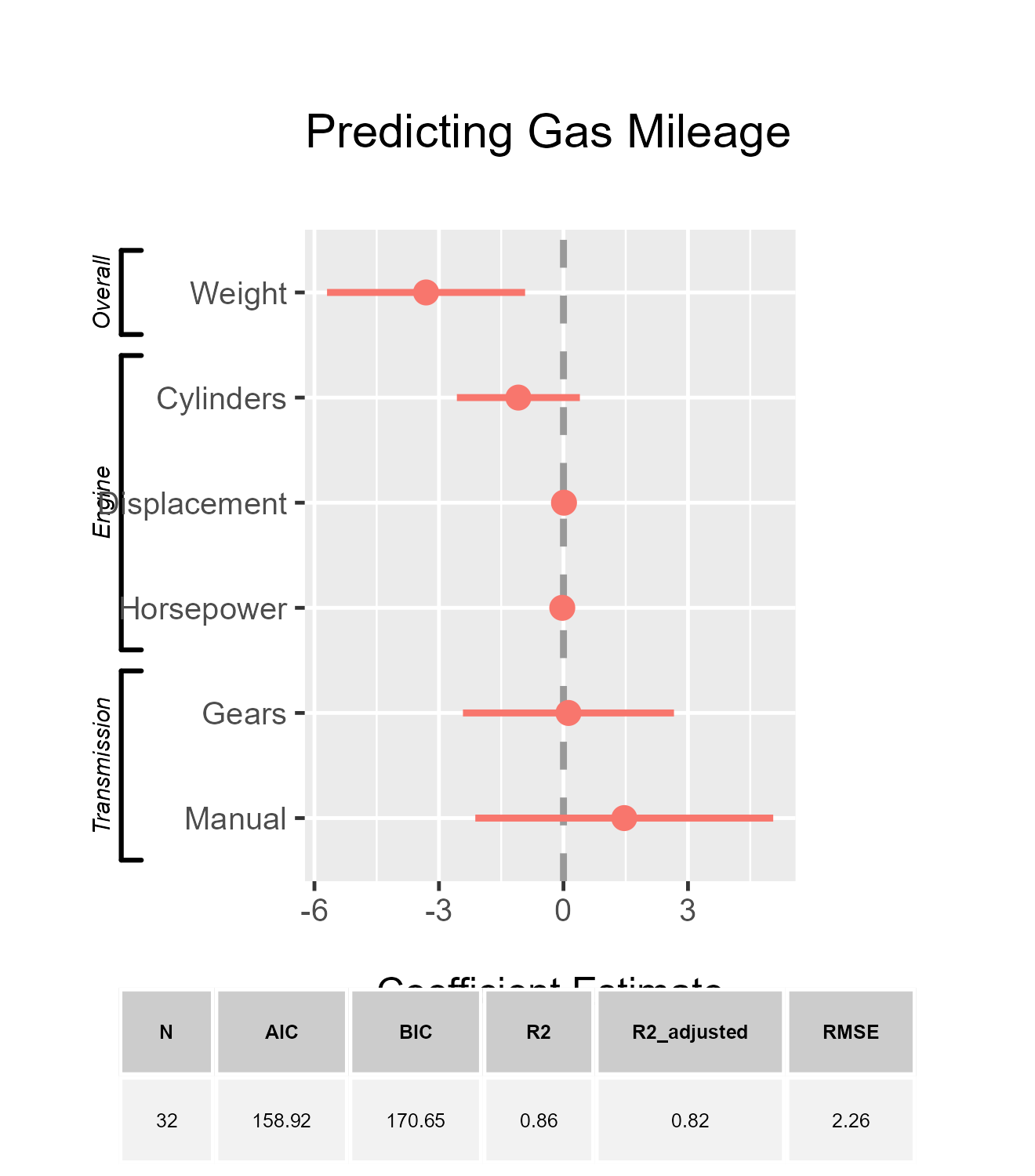
Conclusion
The dotwhisker package provides a flexible and
convenient way to visualize regression results and to compare them
across models. This vignette offers an overview of its use and features.
We encourage users to consult the help files for more details.
The development of the package is ongoing. Please contact us with any questions, bug reports, and comments.
Affiliation
Frederick Solt
Department of Political Science,
University of Iowa,
324 Schaeffer Hall,
20 E Washington St, Iowa City, IA, 52242
Email: [email protected]
Website: https://fsolt.org
Yue Hu
Department of Political Science,
Tsinghua University,
Mingzhai 414,
Zhongguancun Avenue, Haidian, Beijing 100084
Email: [email protected]
Website: https://www.drhuyue.site